A Simplified Step-by-Step Blueprint For Boosting Your Sales Page Conversion Rates
SO, you’ve made yourself a killer product. Whatever it is, an in depth course, coaching program, or a piece of software, you’ve created it and you KNOW it’s going to help people save time & improve their lives.
But now comes the hardest part, selling it!
You send traffic to your page, but the sales just aren’t what they should be. This is the moment that most business owners hit a roadblock. They have a potential 6-figure product, but a 3-figure sales page.
But who am I to speak on this matter? Well, I’ve made sales pages for handfuls of product launches that have produced over $100,000 in sales – with the most successfull generating around $250,000 in total sales volume from a SINGLE product launch. So I’ve iterated through all of these sales page sections many times & tried a lot of variations.
A true Six figure sales page isn’t defined by it’s design alone, though it should look professional of course. It’s defined by it’s architecture. It’s a carefully engineered psychological journey that’s meant to take each individual visitor from complete skepticism, to emotional excitement, to logical confidence. By the end, it should just MAKE SENSE that they must buy your product, it would be stupid not to!
In this guide, I will dissect my exact 10-step anatomy used by the worlds top conversion experts,designers, and copywriters, to generate hundreds of thousands of dollars from a SINGLE page. I’m moving bas basic ‘features vs benefits’ and diving into the deep psychological triggers that make people click ‘buy now’.
My Core Thoughts on sales page conversion:
People buy through emotion, then rationalize with logic (in that order).
Before I lay out the first ‘brick’ of the sales page, you first must understand this foundational concept. The average person is bombarded by literally THOUSANDS of marketing messages every single day. Their default setting is ‘ignore’ or ‘skip’.
To break through, your sales page / marketing message cannot just provide information. Information doesn’t sell anymore, transformation does.
A 6 figure sales page is designed to, of course, solve a specific problem or set of problems, at it’s core. But if your reader doesnt feel like you TRULY understand them and their problem, they will never trust your solution. Your first job is empathy not promotion.
Now lets start to build your high converting sales page piece by piece.
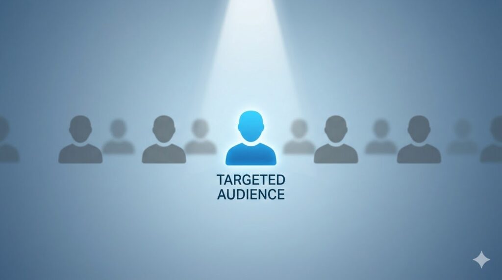
Step 1: The Pre-Headline Hook – Addressing The Right Person
Just imagine walking into a chaotic and crowded room and trying to instantly give a speech. If you just start talking, nobody will listen, in fact they’ll probably think you’re insane 🙂 But if you pull out a chair, stand up on it and start shouting, everyone will listen. Of course this is a crude example, but I think you get the picture.
This is the job of the pre-headline hook (also known as the lead-in, or eyebrow headline).
Why the pre-headline works
In marketing, trying to be everything to everyone simple doesn’t work well anymore – there’s too much of that already out there. To convert at a higher level, your page MUST feel personalized and specific. The pre-headline is your first filter, as it qualifies the right kind of visitor to continue, making them think ‘Ok yeah, this page is exactly for me’.
How to write one
Keep it simple. You’re explicitly naming your ideal customer or their primary frustration points. Something like this:
- “Attention [insert specific audience type]”
- “For the [insert specific profession] who wants [specific result] without the headache of [specific paint point]”
- “Tired of [specific frustration]? Read this immediately!”
So maybe something like:
“Attention freelance writers feeling burned out by low paying clients..”
or
“For the aspiring micro-SaaS founder who is ready to build their first app in under 48 hours (even if you dont know how to code)”
Step 2: The Magnetic Hook

Advertising tycoon David Ogilvy once ssaid “On average, five times as many people read the headline as read the body copy. When you have written your headline, you have spent eighty cents out of your dollar”. So you can easily see how important the top of your sales page is.
If your headline fails, the rest of your entire sales page will be affected no matter how super amazingly awesome it is. the headline has one job: to buy you 15 seconds required for the reader to read the next sentence – sparking interest. It’s not about clever semantics or poetics, it’s about a specific irresistible promise.
Psychology of a KILLER headline
Top conversion specialists like Niel Patel or Copy Hackers show that top preforming headlines usually combine these elements:
- A specific desired results (get 1,000 new email subscribers)
- A defined timeframe (in the next 60 days)
- The removal of a primary fear / objection (without spending a dime – without writing a line of code etc)
- A sense of scarcity or curiosity (using the simple formula revealed inside)
Here’s some examples of what these may look like in action:
“How to grow a profitable newsletter to 10,000 subscribers in under 6 months – without being spending a single penny!”
or
“Double your inbound leads in 90 days with our proprietary lead generation system – or we DOUBLE your money back!”
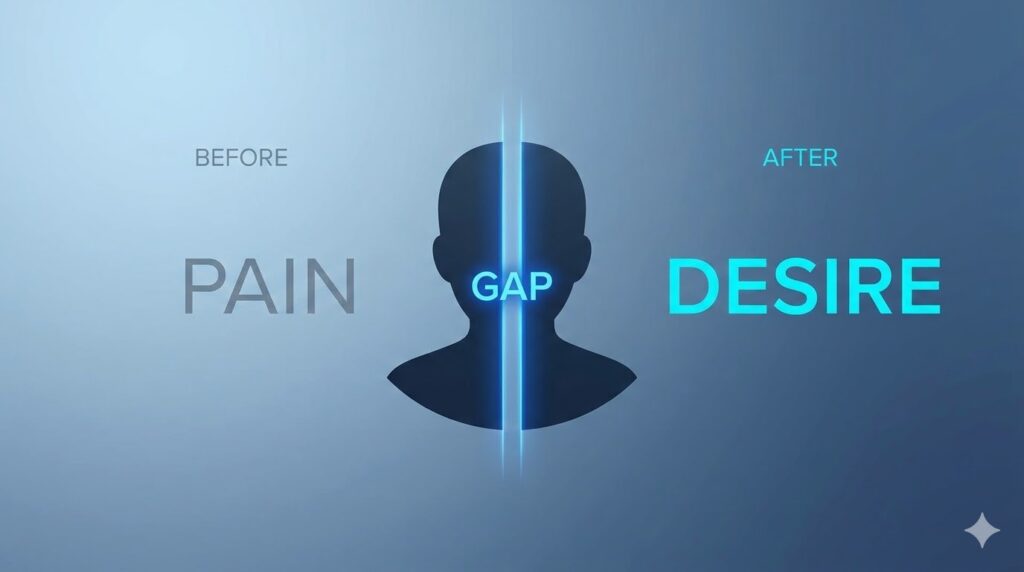
Step 3: The Empathy Gap – Agitating Pain Points
Now that you have their attention, you must now use it to show them that you understand their situation. You must enter the conversation that’s already happening inside your visitors mind. This section is where the sale is truly lost or WON.
You are building an empathy gap, the space between where they are now and where they want to be (the problem that your product solves).
How to ethically agitate the pain points
Your visitor is likely frustrated, tired and overwhelmed. You have to use their own language and feelings to describe their situation better than they even could. So you must:
- Describe their current state. Use vivid, specific language. What does their frustration actually FEEL like, what do they see / feel / say to themselves when theeeeyyy.. check their bank account balance, for instance.
- Identify the root causes of these feelings, and identify WITH them in these feelings (you were in their shoes). What are the invisible road blocks that have been stopping them so far in their journey? Why have their past attemps failed?
- Use the consequence of inaction. What happens if they dont solve this problem that they’re facing? For example: Another 12 months of no growth, all while their competitors are growing etc.
I’m going to give you some exact examples of those three things in action.
So for instance, instead of saying:
“You need more traffic”..
you could say something like:
“You spend weeks pouring your soul into creating your product, you hit PUBLISH and then… nothing. Crickets fill the air, the sound of the crushing weight of another wasted launch. You check your stats every hour, hoping for a miracle that never comes”.
Don’t say:
“Your pricing is too low”
Instead say:
“You’re stuck in the endless freelance doom loop. You know your work is worth five grand, but your’re accepting 500 dollar projects just to keep the lights on.”
OK enough of that, next step.
Step 4: Selling Them a Bridge To Their Future Self – Painting The Solution For Them
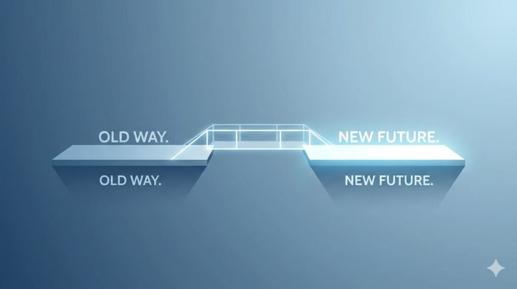
If you left the reader in the problem section, they would leave your page more depressed than when they arrived. But of course you won’t do that.. Youve successfully opened the wound, now you have to show them the cure. Your cure!
This section is the bridge. Your product is not the bridge itself, but rather it’s the tool that they’ll use to cross the bridge with (avoiding the waters, or problems / paint points, below them).
In this section, you’re painting a vivid mental picture in their head of their life AFTER their problem is solved. The MUST at least get a glimpse of what this feels like to already have their problem solved – and how your product is the solution that will take them there.
Focus on the primary benefits and differences of them now vs. their desired future self. Don’t just simply list product features, at least not yet.
People dont buy features, they buy outcomes. They buy how those features will change their lives, identity, bank accounts, social status etc etc.
Emphasize focusing on the final positive transformation or outcome, first. Here’s some examples off the top of my head of how you may want to write something like this:
“Imagine waking up tomorrow morning, checking your email, and seeing a STREAM of new customers & sales that came in while you were sleeping.”
or
“Picture yourself confidently hopping onto a sales call, not hoping for the client to say yes, but KNOWING that your page has already sold them. Imagine a world where you never have to CHASE a low-paying client ever again because premium high paying client are literally chasing YOU.”
Step 5: The Solution (Introducing your offer)

OK so, you’ve successfully identified their core problems, and fueled their desire for the solution. Now is the right time to introduce them to your product. Because you’ve structured it this way, your product doesn’t feel like a ‘pitch’, but rather a natural, seamless next step.
Your offer must be presented as a unique and specific SOLUTION. Your visitor has probably tried multiple other things to get their desired outcomes before. You must explain why your product is better, different, more efficient, cheaper, guaranteed to work etc. (any actually make sure it is of course!)
Stacking your offers with more & more value
Structure this sales page section kind of like a stack of values. Instead of a single product, pitch it as an ecosystem of tools designed to ensure their success. For example –
- The Core System: The 10 module sales page video course
- The Tools: Done for you templates, checklists, graphics packs
- Bonuses: Live Q&A session, access to private community etc.
Step 6: Social Proof

At this stage of their journey, your visitor wants to believe you, but their internal skeptic has probably been burned before by other offers, leaving a sour taste in their mouths.
You MUST answer this objbection not with your own words, but directly from the mouths of other people that were EXACTLY where they are right now – and have come out on top by using YOUR product! This is the powerful principle of social proof.
If you’re making a sales page for a very high priced product, then simple and short social proofs will not be enough. They will look fake. You need data driven proof of emotional transformation from using your product – by people that have used it and WON.
Types of powerful social proof sections
- Specific transformation testimonial: For these, focus on the before vs after. IE: ” I was only making one sale every couple days before, but after implementing this system, I was able to grow to 20-30 sales a day consistently!”
- Data overload proof: Share screenshots of bank accounts, analytics, dashboards, traffic graphs etc. Of course be sure to not leave in any sensitive data!
- Authority proof: Has a well known industry expert tried your product before? Did you product get featured or reviewed anywhere before? These work VERY well. If they haven’t, don’t be afraid to reach out to website owners, people that may be interested, to try a free copy of your product in exchange for an honest review! You could also have a ‘Beta’ launch of your product, for this reason alone – and to work out bugs as well.
- Objective handling testimonial: Find a testimonial from someone who was originally skeptic, or someone who had the exact same objections as your soon to be new customer has.
As a great example:
“Within 14 days of using this formula, I was able to take my conversion rate from 1.2% to 7.8%. That single change has net me an extra $15,489 in sales so far this month. I would have happily paid 10 times the price for this product!”
Step 7: Price Anchoring: Reframe Expectations
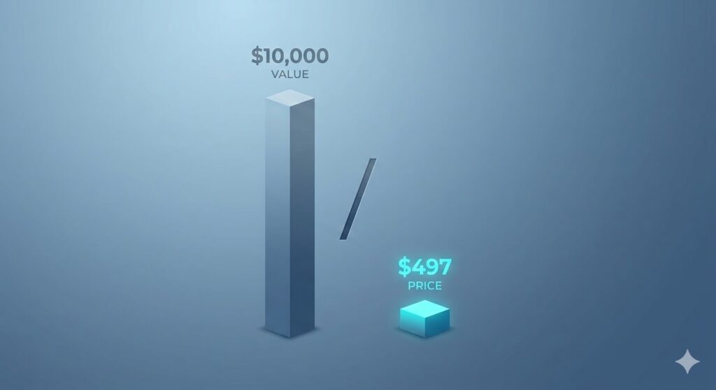
You’re now ready to reveal the price. This is where most sales pages lose momentum, but not yours. If you just state the amount – especially when talking higher priced products – you can lose a large majority of visitors instantly.
The BEST way to approach this, is at some point BEFORE they see your price, make sure they’ve already seen the higher prices of your competitors – or even your own price before your current sale or however you’d like to do it. Just make sure they’ve already seen a higher price beforehand.
Firstly, this already sets expectations in their head of roughly what they should be expecting to pay when they DO see your buy button / your price. This also gives you a chance to be lower than that expectation. This simple overlooked addition can really help with conversions.
The idea is simple really, by establishing a very high number (the anchor) previously, this makes the visitor view the price of your product as a substantial discount to what they were expecting.
If they’ve already been anchored to other online coaching programs being $10,000 before they see your price, then when they see your $500 they suddenly feel like they’re getting a GREAT bargain! This will also allow you to upsell and downsell much easier.
Here’s some specific price anchoring techniques you may want to try in your sales page:
- The Total Value Anchor: Before revealing the final price, list the real world market value of every single component of your product (the course with all the modules, templates, coaching, etc)
- The Decoy Anchor: Display three tiers of pricing, like basic pro premium, with the main job of the most expensive tier is the make the main tier look more attractive. Of course dont lie about this haha.. you have to actually have all three tiers available.
- The Time vs. Money Anchor: Compare the cost of your product to the cost of NOT buying it. For example, how much revenue are you losing every single month because your sales page is only converting at 1%? If youre missing just $2000 in sales monthly, that adds up to $24,000 in lost revenue every single year!
Step 8: The Risk Reversal (Using a rock solid guarantee)

At the moment right before purchase, typically people will fear some level of fear. Fearing that they aren’t making the right decision.
A good high converting sales page should absorb their fears & these risks. You must remove all frictions, by offering a guarantee that feels almost too good to be true. This is the powerful principle of the risk reversal section.
If you truly believe in your product, you have to make it logically stupid NOT to buy!
Here’s some high converting strategies for your guarantee section:
Top level copywriters will typically move past your basic ‘money back guarantee’ to something more extreme.
- “Double your money back” guarantee. This is extremely powerful, but inherently can be more risky for actually refunding a sale.
- “Specific outcome” guarantee. This would be something like – Use my system for 60 days, and if you dont generate at least 5 new high paying clients, I will not either you a 100% refund – or work with you 1-on-1 until you do!
Step 9: Deep Dive CTA (Call-to-action) Commanding The Click
This is the final destination of your visitors journey. The entire page has led to this one section – this one click.
Many pages fail before this point – let alone mastering this section by itself. They use passive button text like ‘submit order’ or something dumb dumb.
Top conversion data sources clearly show that passive language does not convert well. A true high converting CTA must be clear, commanding, and focused on the immediate benefit. This section often has badges of the guarantee from the previous section, placed below the buy button.
Here’s some attributes of a good call-to-action section:
- The CTA headline: Reiterate the promise of your product one last time. Something like “Yes! I am ready to double my sales”. Again, framing certain headlines from the visitors voice has been proven to boost conversion rates.
- The benefit driven button: Start the buy button with strong active verbage, maybe something like “Get Started Now”, or “Claim your…. ” . “Secure your.. “. Focus on what they get, not what they have to pay to get it.
- Micro copy trust signals: This is the crucial text immediately below the buy button. This is where you can reiterate the guarantee, or have guarantee badges, along with 100% secure checkout badges, or ‘lifetime access’, ‘one time payment’, no hidden fees etc.
Step 10: Using a Logic Based FAQ Section

Even after seeing amazing proof, a potential buyer will most likely still have some friction points, or objections, preventing them from moving forward and purchasing. As they scroll down towards the buy button, their brain is running a final inventory of their logical fears and doubts.
This is the section where you input EVERY main objection and question that your visitors may have while on your sales page – and answer them. You can build these by yourself, or while beta testing, or simply by brainstorming for this specific reason.
Use this specific strategy. As I just said, brainstorm every possible reason someone could have for not buying your product. IE: Time, money, will this work for my niche, does it work with [whatever].
After this, write out each question / objection framed in THEIR voice, ‘will this work for me’ etc. Answer these points with logic and empathy… Giving each question a confident and specific solution that leaves no room for doubt. You may even refer back to them your guarantees or social proof points.
CONCLUSION: Each Section Has It’s Own Purpose
Congrats! If you meticulously design each section of your sales page with these steps in mind, the end result WILL convert better than your average page – and if done very well, could be the bridge to your next 6 figure product.
Here’s a basic implementation roadmap to follow:
- Draft & focus on your headline, and top sections, the areas your visitors see first, focus on this section MOST. This sets the tone for the rest of the page. If you have access to heat-mapping software, you can map the percent of people that leave before even scrolling.
- Make sure to nail the empathy – when it comes to your visitors pain points. Conduct surveys or interviews if you are struggling with the exact language of their pain points.
- Make sure to not immediately list features until you get to the offer sections.
- Edit your page ruthlessly from top to bottom, constantly improving little sections. While writing, you may have learned something new about your offer. Reread your final CTA first, then take another look at your top page headline to make sure they flow together nicely.
Your GREAT product deserves a spectacular sale page to match. Make sure to take some time to ensure your sales conversions are on point!
Leave a Reply